How to Embrace Color Trends Without Going Overboard
Color has the power to completely shift the mood of an outfit, elevate wardrobe aesthetics, and inject personality into everyday styling. But embracing colorful fashion does not mean dressing head-to-toe in every trending shade at once. The key lies in visual balance, intentional color use, and understanding how to create a cohesive color palette that feels expressive yet wearable. From subtle color accents and monochromatic styling to balancing bold and neutral tones, there are countless ways to experiment with modern color trends while maintaining understated elegance. This guide explores approachable styling ideas, color confidence tips, and practical ways to wear vibrant hues without creating color overload.
Why Color Feels So Intimidating — And Why It Shouldn’t
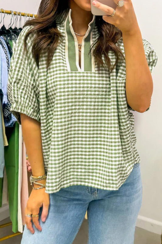
For many people, embracing color feels surprisingly personal. Black, beige, navy blue, and white basics often become safety blankets in wardrobe styling because they feel timeless, polished, and easy to coordinate. Yet colorful fashion has evolved far beyond loud maximalism or chaotic color blocking.
Today’s wearable color trends focus on balance.
Instead of overwhelming combinations, fashion styling now leans into:
- layered colors
- earthy tones
- jewel tones
- soft contrast styling
- complementary colors
- tonal dressing
- playful color paired with grounded neutrals
The result is expressive fashion styling that still feels sophisticated.
One of the biggest misconceptions about adding color to outfits is believing every piece has to compete for attention. In reality, some of the most effective colorful styling ideas come from restraint.
A single vibrant hue surrounded by muted tones often creates more impact than an outfit overloaded with competing shades.
This is where color psychology becomes useful. Certain shades naturally command attention, while others soften visual contrast and create breathing room. Understanding this balance can dramatically improve outfit coordination and fashion confidence.
For example, pairing rich statement shades with understated basics instantly makes bold colors feel more approachable.
A bright knit layered beneath tailored neutrals feels intentional rather than overpowering. Similarly, introducing a soft pink blouse under structured outerwear creates color harmony without abandoning minimalist color styling altogether.
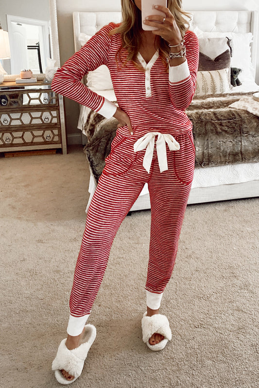
Start With One Dominant Shade
One of the easiest ways to avoid overdoing color is to focus on a single dominant tone throughout your look.
This creates a curated color palette that feels polished instead of chaotic.
If you’re experimenting with dopamine dressing or fashion color trends 2026, try anchoring your outfit around one key color family before introducing secondary tones.
For example:
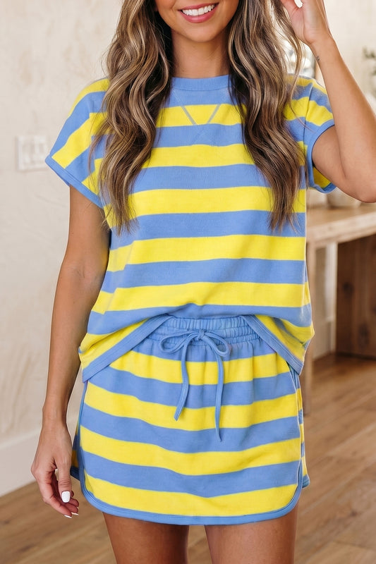
- green and blue combinations paired with denim
- soft pink with grey layers
- earthy browns balanced by cream textures
- jewel tones grounded with black and white basics
- muted orange styled with semi-neutrals
This approach creates visual cohesion while still allowing room for color experimentation.
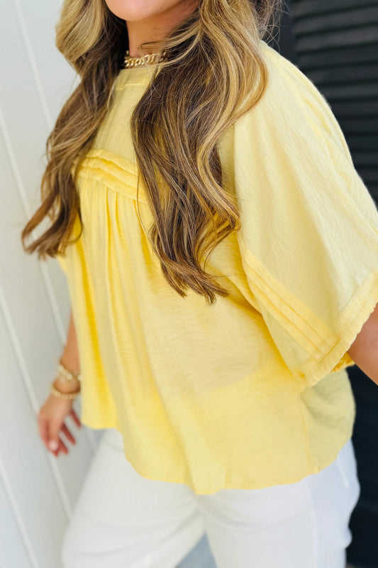
If you’re unsure where to begin, softer shades tend to feel less intimidating than highly saturated tones. Collections featuring muted yellows, washed greens, or dusty pinks can help build color confidence gradually.
Explore understated bright tones through the women’s yellow clothing collection, which pairs beautifully with beige tones, denim, and warm neutral layers.
Likewise, soft feminine hues from the women’s pink clothing collection work exceptionally well for tonal dressing and effortless styling.
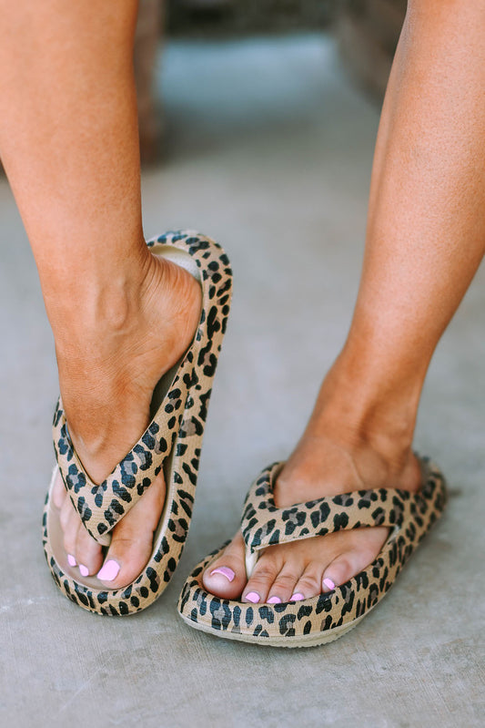
The Secret to Wearing Bold Colors Without Overdoing It
One of the smartest color layering techniques is balancing vibrant hues with neutrals that calm the overall outfit.
Think of neutrals as visual anchors.
Without them, colorful fashion can quickly drift into imbalance. With them, even statement pieces become easier to wear daily.
Some timeless grounding combinations include:
| Bold Color | Neutral Pairing |
|---|---|
| Emerald green | Cream or camel |
| Bright red | Grey or black |
| Cobalt blue | White or stone |
| Purple | Beige or charcoal |
| Orange | Soft tan |
These combinations create color saturation balance while maintaining approachable styling.
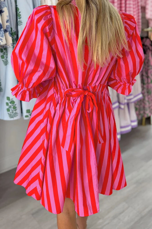
For example, a dramatic knit from the women’s red clothing collection instantly feels more refined when layered under neutral outerwear or paired with minimalist tailoring.
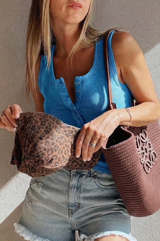
Similarly, cool-toned shades from the women’s blue clothing collection offer an easy entry point into colorful fashion because blue naturally works as a semi-neutral in many wardrobes.
This principle also mirrors interior design color trends. In colorful interiors, designers often use white trim, wood textures, and layered decor to soften statement wallpaper or colorful artwork. Fashion works the same way — visual breathing room matters.
Monochromatic Styling Creates Instant Sophistication
One of the most underrated ways to wear color tastefully is monochromatic styling.
Instead of mixing many contrasting colors, this technique focuses on varying shades within the same family. The result feels elegant, modern, and incredibly wearable.
A monochrome palette naturally creates:
- visual balance
- color harmony
- cohesive outfit styling
- understated elegance
- elevated casual styling
It also makes seasonal color trends easier to adopt without feeling trend-driven.
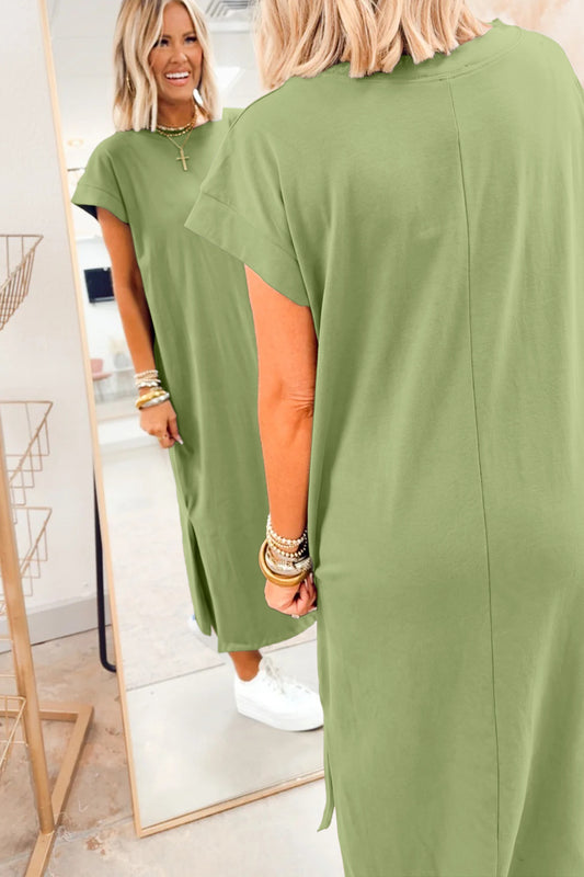
For instance, layering varying shades from the women’s green clothing collection creates depth without visual clutter. Olive, sage, moss, and forest tones work beautifully together because they share natural undertones.
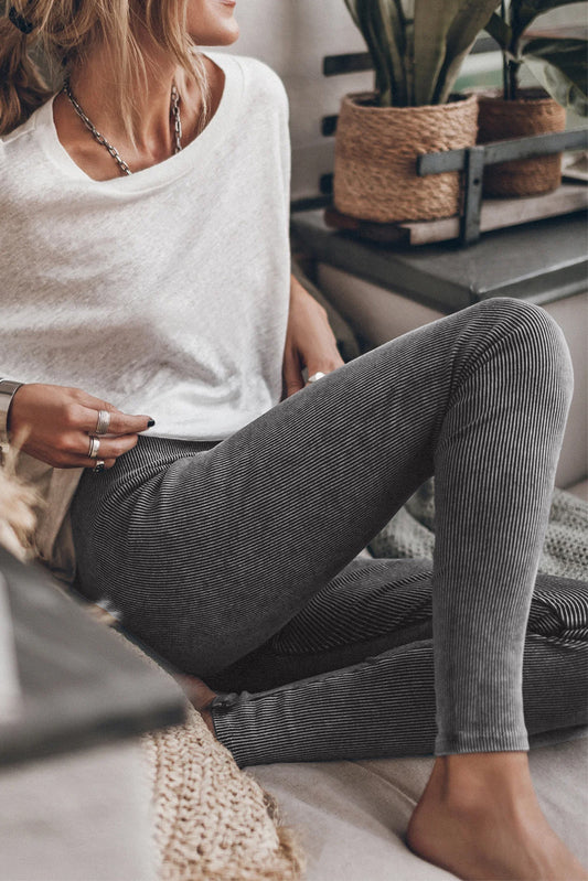
The same concept applies to soft neutrals. Building outfits around the women’s grey clothing collection creates a quiet luxury color palette that feels timeless yet contemporary.
Easy Ways to Build a Monochromatic Look
- Start with one base shade
- Layer lighter and darker variations
- Mix textile textures for dimension
- Add one subtle accent color if needed
- Keep accessories tonal and refined
This prevents color overload while still embracing colorful fashion trends in a polished way.
Why Texture Matters Just As Much As Color
Sometimes an outfit feels overwhelming not because of the shades themselves, but because every element competes visually.
Patterned fabrics, glossy finishes, statement accessories, and contrasting colors can all create tension if layered without intention.
That’s why many color consultants focus equally on texture and silhouette when helping clients build a balanced color palette.
Soft knits, matte fabrics, brushed cottons, and structured tailoring help bold shades feel grounded. This is especially important when experimenting with vibrant hues like orange, purple, or multicolor styling.
Rich tones from the women’s purple clothing collection become dramatically easier to style when paired with textured neutrals or minimalist layering pieces.
Meanwhile, expressive statement looks from the women’s multicolor clothing collection work best when the rest of the outfit remains intentionally streamlined.
In many ways, mastering color coordination is less about strict rules and more about creating enough contrast, softness, and breathing room for each piece to shine naturally.
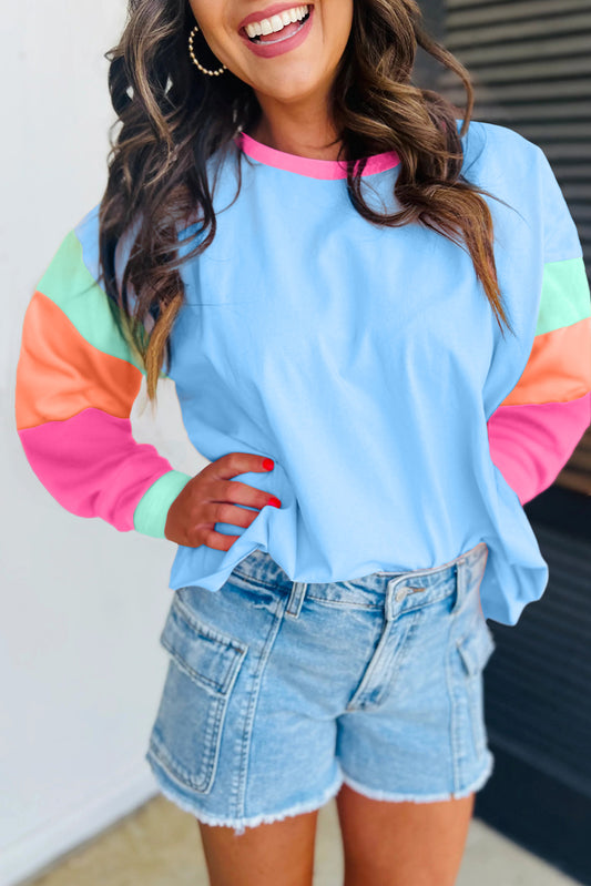
Color Blocking Without Creating Chaos
Color blocking has returned repeatedly throughout modern fashion trends, but today’s interpretation feels far more refined than the ultra-saturated combinations of the past. Instead of sharp visual clashes, contemporary color styling focuses on intentional color use and softer transitions between shades.
The trick is understanding how to mix colors without clashing.
A good rule of thumb is to combine:
- one dominant shade
- one supporting neutral
- one subtle accent color
Anything beyond that can start to feel visually crowded unless the tones share a common undertone or tonal relationship.
For example, warm earthy tones naturally complement each other because they sit harmoniously within the same color family. Rust, camel, soft tan, and muted orange create a grounded color scheme that feels effortless rather than loud.
Similarly, cool palettes built around navy blue, sage green, charcoal, or dusty lavender create a calm sense of visual cohesion.
One particularly wearable approach is pairing statement colors with dependable wardrobe anchors. Crisp pieces from the women’s white clothing collection help soften stronger tones while creating clean visual contrast that prevents outfits from feeling too heavy.
Meanwhile, timeless staples from the women’s black clothing collection remain one of the easiest ways to ground playful color combinations without sacrificing sophistication.
Color confidence rarely comes from wearing more color. It comes from understanding where the eye needs rest.
That principle explains why Scandinavian color palettes remain so popular. Even when incorporating colorful decor or expressive fashion styling, there is always balance between statement elements and negative space.
Fashion operates in exactly the same way.
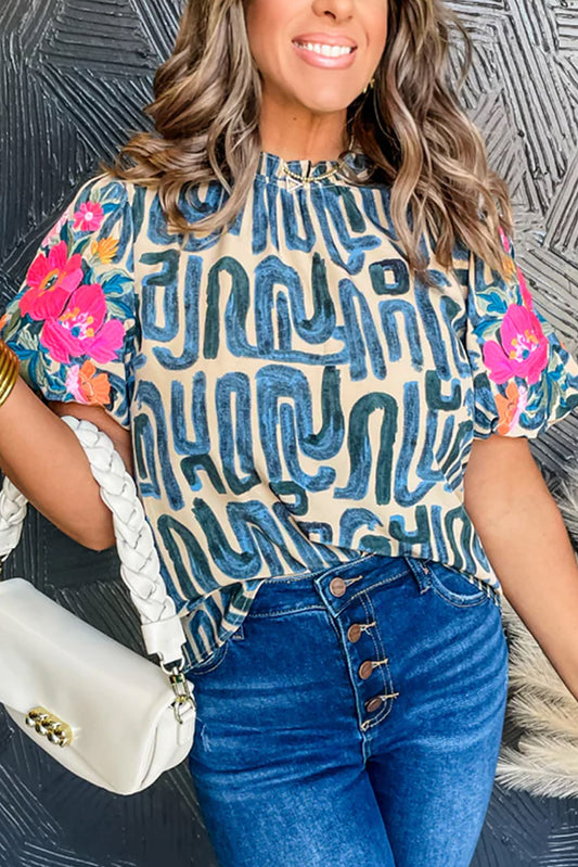
How to Add Color to an Outfit Subtly
Not everyone wants to embrace vibrant hues through dramatic coats or bold tailoring. Sometimes the most effective styling with color comes through quieter details.
Small color accents can completely transform an outfit while still feeling approachable.
Some easy ways to wear vibrant colors include:
- colorful knitwear beneath neutral coats
- statement accessories in jewel tones
- patterned fabrics with muted bases
- colorful scarves against monochrome outfits
- tonal handbags or footwear
- layering textures within one color family
- soft pastel styling paired with creams or greys
This approach is particularly effective for people easing into colorful fashion after years of relying on neutrals.
If chromophobia — the fear of wearing bold shades — has shaped your wardrobe for years, subtle additions feel significantly more manageable than dramatic color experimentation.
This is also where personal style becomes more important than trends.
A seasonal color palette may look beautiful online, but wearable color trends should still align with your lifestyle, comfort level, and wardrobe aesthetics. The goal is not chasing every Pantone release or trending color palette. The goal is learning which shades genuinely enhance your confidence.
Creating a Cohesive Color Palette for Everyday Dressing
One reason some outfits feel instantly polished is because the colors repeat naturally throughout the look.
This repetition creates visual rhythm.
It may appear through:
- matching undertones
- repeated accent colors
- tonal layering
- coordinated accessories
- complementary palette choices
Without realizing it, many people already do this instinctively with neutrals. Black shoes, black outerwear, and black knitwear automatically create consistency.
The same idea works beautifully with colorful fashion.
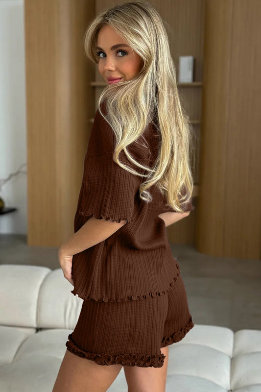
For example, rich earthy styling from the women’s brown clothing collection pairs naturally with warm creams, muted greens, and textured materials for a sophisticated autumn-inspired look.
Likewise, vibrant yet wearable tones from the women’s orange clothing collection become surprisingly versatile when balanced with understated tailoring or minimalist accessories.
When creating a cohesive color scheme, think less about matching perfectly and more about maintaining harmony between saturation, warmth, and contrast.
A Balanced Everyday Formula
A reliable formula for balanced outfit styling often looks like this:
- One dominant shade
- One grounding neutral
- One accent tone
- Minimal competing patterns
- Consistent fabric textures
This creates approachable styling while still allowing personality to come through.
Why Modern Color Trends Feel More Wearable Than Ever
There was a time when colorful fashion often leaned heavily toward maximalism. Bold patterns, clashing tones, and dramatic statement pieces dominated trend cycles.
Now, however, fashion aesthetics have shifted toward more mindful decorating principles within wardrobes themselves.
Today’s trends prioritize:
- intentional layering
- contemporary color styling
- visual balance
- tonal dressing
- soft contrast styling
- understated elegance
- effortless styling
- expressive individuality
Even dopamine dressing has evolved into something more nuanced. Rather than simply wearing the brightest possible outfit, modern interpretations focus on how color affects mood, energy, and self-expression in subtle, wearable ways.
This is why semi-neutrals like olive green, dusty pink, muted lavender, terracotta, and deep navy continue gaining popularity. They bridge the gap between colorful fashion and timeless color styling.
Fashion styling no longer demands extremes.
Instead, the emphasis has shifted toward creating a curated color palette that feels personal, elevated, and adaptable to everyday life.
The Role of Color Psychology in Personal Style
Color psychology plays a far bigger role in wardrobe styling than many people realize.
Certain shades naturally project different moods, energies, and associations:
| Color | Common Association |
|---|---|
| Blue | Calmness and reliability |
| Red | Confidence and energy |
| Green | Balance and freshness |
| Purple | Creativity and luxury |
| Brown | Warmth and grounding |
| White | Simplicity and clarity |
| Black | Sophistication and structure |
Understanding this helps explain why some outfits instantly feel “right” while others feel disconnected or overwhelming.
It also explains why balanced interiors and colorful home styling follow many of the same principles. Whether designing a colorful living room or choosing an outfit, visual aesthetics rely heavily on harmony, restraint, and contrast.
A carefully styled wardrobe works almost like interior design:
- statement pieces create focus
- neutrals provide breathing room
- textures add dimension
- accent colors guide attention
- repetition creates cohesion
The most stylish looks rarely rely on excess. They rely on balance.
How to Build Long-Term Color Confidence
True style confidence does not come from blindly following seasonal color trends. It develops gradually through experimentation, observation, and understanding what genuinely feels authentic to you.
One of the biggest mistakes people make when embracing color is assuming they need to completely reinvent their wardrobe overnight. In reality, the most successful transitions happen slowly.
A carefully chosen accent color here.
A tonal knit there.
A statement piece layered against familiar basics.
Over time, those small shifts completely reshape how you approach personal style.
This is especially important because trends move quickly. Fashion color trends 2026 may celebrate vibrant hues and expressive styling now, but timeless color styling always outlasts trend cycles. Building a wardrobe entirely around temporary color crazes often leads to pieces feeling outdated within months.
Instead, focus on:
- wearable shades you repeatedly gravitate toward
- complementary colors that work with existing staples
- balanced outfit styling over novelty
- quality textures and layering
- adaptable statement pieces
- intentional color use rather than excess
That balance creates longevity.
For example, rich tones from the women’s purple clothing collection can feel fashion-forward one season and timeless the next when paired with understated silhouettes and cohesive accessories.
Likewise, grounding your wardrobe with versatile neutrals while introducing seasonal pops of color creates flexibility without overwhelming your personal aesthetic.
The goal is not to wear more color. The goal is to wear color more intentionally.
Why Neutrals Will Always Matter
Even the boldest dressers rely on neutrals more than they realize.
Neutrals are what make colorful fashion feel elevated instead of chaotic. They create visual breathing room and allow accent shades to stand out naturally.
Without grounding tones, even beautiful color combinations can begin competing for attention.
Classic neutrals include:
- black
- white
- grey
- navy blue
- cream
- beige tones
- soft brown
- muted olive
These shades work because they stabilize stronger colors while maintaining sophistication.
In many ways, neutral tones act like framing in interior design. Just as colorful artwork feels more impactful against clean walls or textured wood finishes, vibrant fashion pieces become more wearable when anchored by timeless basics.
This is one reason minimalist color styling continues to influence both fashion and interior design color trends. Even maximalist-inspired looks now incorporate visual balance through layering, tonal repetition, and understated structure.
Collections featuring soft neutrals, earthy tones, and muted shades often become the foundation for approachable styling because they blend seamlessly with both seasonal trends and classic wardrobe essentials.
How to Mix Warm and Cool Tones Successfully
One of the most overlooked color layering techniques is learning how to combine warm and cool tones without disrupting visual cohesion.
Many people assume colors must match perfectly, but contrast often creates far more interesting styling.
The key is moderation.
Warm tones include:
- terracotta
- mustard
- rust
- camel
- warm browns
- golden yellows
Cool tones include:
- cobalt blue
- charcoal grey
- emerald green
- icy pink
- lavender
- silver undertones
Pairing warm and cool shades strategically can create depth and sophistication without causing color overload.
For example:
- cool denim balances warm orange beautifully
- emerald green pairs effortlessly with beige tones
- lavender softens structured charcoal tailoring
- rich burgundy complements soft grey textures
This type of thoughtful contrast creates visual interest while still maintaining a balanced color palette.
It also mirrors principles found in contemporary interiors and artistic styling, where contrasting materials and tones are layered intentionally to prevent spaces from feeling flat or predictable.
Statement Pieces Work Best When Everything Else Relaxes
One of the simplest styling rules for colorful fashion is this:
If one piece is loud, let everything else soften around it.
This principle applies across fashion aesthetics, interior color palettes, and even personal branding. Strong focal points naturally need surrounding simplicity to feel effective.
A vibrant coat.
A bold knit.
A patterned skirt.
A pair of colorful heels.
These pieces shine brightest when paired with:
- clean silhouettes
- tonal basics
- monochromatic styling
- muted accessories
- subtle makeup
- understated layering
Trying to make every element stand out at once often creates visual tension rather than intentional style.
This is where many people unintentionally drift into overdoing color. The issue is rarely the bold shade itself — it is the lack of balance around it.
Fashion consultants often refer to this as controlling visual weight. Every outfit has areas that naturally attract attention. The more colorful or detailed an item becomes, the more restraint the surrounding pieces require.
That contrast is what makes colorful fashion feel polished rather than overwhelming.
Final Thoughts on Embracing Color With Balance
Color should feel exciting, expressive, and personal — not intimidating.
The most stylish wardrobes are rarely built around extremes. Instead, they rely on thoughtful combinations, balanced color palettes, layered textures, and intentional contrast.
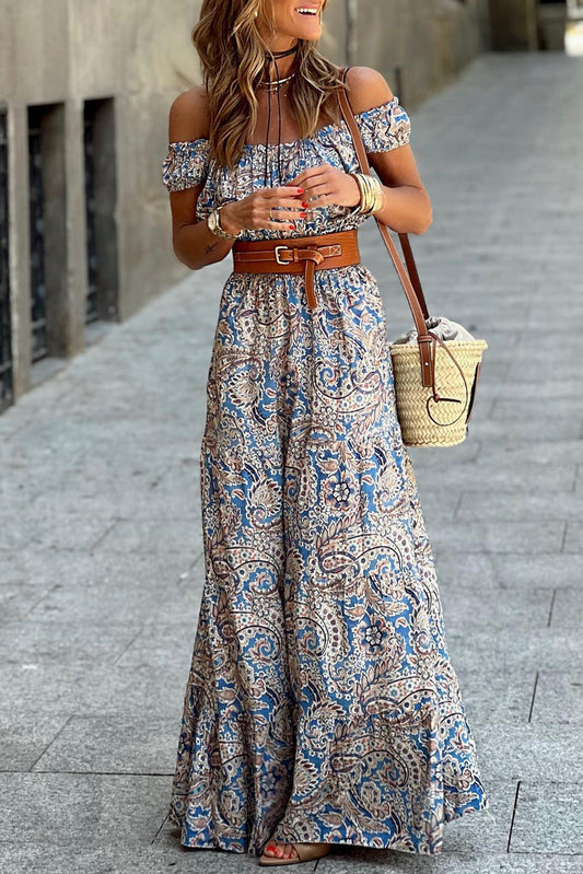
Whether you gravitate toward jewel tones, soft pastel styling, earthy neutrals, or playful pops of color, the secret lies in understanding visual harmony rather than chasing every passing trend.
Fashion is ultimately about creating confidence.
Some people feel empowered through monochromatic styling and quiet luxury color palettes. Others prefer expressive fashion styling filled with vibrant hues and statement accessories. Both approaches work beautifully when supported by cohesion, balance, and authenticity.
As modern color trends continue evolving, one thing remains timeless:
Wearing color successfully is not about being louder.
It is about being more intentional.
And often, the smallest touch of color creates the strongest impression.
Frequently Asked Questions
1. What colors are easiest to start with if I usually wear neutrals?
If your wardrobe mainly consists of black, white, grey, or beige tones, start with softer shades that function almost like semi-neutrals. Sage green, dusty pink, muted blue, lavender, and earthy terracotta are excellent transition colors because they blend naturally with timeless basics while still adding personality and depth.
2. Can colorful fashion still look professional?
Absolutely. The key is maintaining visual balance and choosing sophisticated color combinations. Structured silhouettes, tonal dressing, and subtle color accents help vibrant hues feel polished rather than distracting. Rich jewel tones, navy blue, forest green, and muted burgundy work especially well in professional wardrobe styling.
3. How do I know if an outfit has too much color?
A good indicator is whether your eye knows where to focus first. If every piece competes equally for attention, the outfit may feel visually overwhelming. Creating one focal point and balancing it with grounding neutrals usually prevents color overload.
4. Are pastel colors easier to style than bright colors?
In many cases, yes. Pastel styling often feels softer and more approachable because muted tones create less visual contrast. Soft pink, powder blue, lilac, and pale yellow tend to pair effortlessly with neutral tones and minimalist layering.
5. Do certain colors make outfits look more expensive?
Yes. Deep jewel tones, earthy neutrals, monochromatic styling, and cohesive color palettes often create a more elevated appearance. Shades like camel, charcoal, cream, navy, olive, and chocolate brown are commonly associated with understated elegance and quiet luxury styling.
6. How can I make trendy colors feel timeless?
The easiest way is to incorporate trends through smaller statement pieces or accent colors instead of rebuilding your entire wardrobe around them. Pairing modern color trends with classic tailoring, quality textures, and timeless wardrobe essentials keeps outfits feeling current without becoming overly trend-driven.
7. What is the difference between color blocking and tonal dressing?
Color blocking combines distinct contrasting colors to create visual impact, while tonal dressing focuses on layering varying shades within the same color family. Tonal looks generally feel softer and more refined, whereas color blocking creates stronger contrast and energy.
8. How do accessories help with embracing color?
Accessories offer one of the simplest ways to experiment with colorful fashion without committing to bold full outfits. A vibrant handbag, scarf, shoes, or statement jewelry piece can introduce playful color while maintaining balanced outfit styling.
9. Should warm and cool tones ever be mixed together?
Yes — when done intentionally. Mixing warm and cool tones can create depth and visual interest. The trick is ensuring one tone remains dominant while the secondary tone acts as a supporting accent. Balanced contrast often feels more sophisticated than overly matched outfits.
10. Why do some colorful outfits feel stylish while others feel overwhelming?
The difference usually comes down to color harmony, texture balance, and visual spacing. Stylish colorful outfits often include grounding neutrals, repeated undertones, layered textures, and intentional focal points. Overwhelming outfits tend to combine too many competing shades, patterns, or statement details simultaneously.