Rainbow Without the Cliché: Wearing Colour Blocking in 2026
Colour blocking is having a major revival in 2026, but not in the loud, overly coordinated way many people remember. Today's approach is more refined, intentional, and wearable. Instead of simply combining every bright shade possible, modern colour blocking focuses on strategic colour placement, sophisticated colour combinations, and a strong sense of visual balance.
The biggest fashion colour trends 2026 embrace everything from cobalt blue and red to butter yellow and brown, while drawing inspiration from runway colour trends, contemporary maximalism, and expressive dressing. Whether you're experimenting with colourful tailoring, statement knitwear, or colour-block outfits built from elevated basics, the goal is no longer shock value—it's confidence.
This guide explores how to wear colour blocking in 2026, the chicest colour pairings of the season, and why the new era of rainbow dressing feels far more luxurious than its predecessors.
Rainbow Without the Cliché: Wearing Colour Blocking in 2026
For years, colour was treated as fashion's guilty pleasure.
Minimalism dominated wardrobes. Neutral palettes became status symbols. Entire social feeds were filled with beige, cream, taupe, and black. Then something shifted.
The quiet luxury backlash arrived.
Suddenly, fashion week trends began showcasing saturated hues, statement colours, and expressive luxury. Designers embraced vibrant colour once again, but with a level of sophistication that felt worlds apart from the colour blocking trend's first mainstream wave.
This isn't about dressing like a box of crayons.
It's about understanding colour theory, mastering colour harmony, and using bold styling techniques to create outfits that feel curated rather than chaotic.
The most stylish people in 2026 aren't wearing more colour. They're wearing colour more intentionally.
That distinction matters.
Modern colour blocking is less about volume and more about placement. Less about novelty and more about self-expression through fashion.
Why Colour Blocking Feels Different in 2026
The colour trend 2026 isn't emerging in isolation.
It's arriving after years of tonal dressing, minimalist wardrobes, and understated luxury aesthetics. As a result, today's colourful dressing feels fresh rather than excessive.
Several factors are driving this movement:
The Rise of Contemporary Maximalism
Fashion has entered a new phase where individuality is once again celebrated.
Instead of relying on logos or trend-heavy pieces, consumers are using colour as a form of personal identity. This shift has fuelled a new wave of expressive dressing that feels artistic, confident, and remarkably wearable.
We're seeing:
- Rich colour palettes replacing all-neutral wardrobes
- Fashion-forward colour combinations dominating street style
- Colourful outfits becoming everyday staples
- Dopamine dressing evolving into something more refined
- Statement dressing moving beyond occasion wear
The result is contemporary maximalism—a smarter, more curated version of maximalist fashion.
The Secret to Sophisticated Colour Blocking
One of the biggest misconceptions surrounding colour blocking is that more colour automatically equals better style.
In reality, sophisticated colour blocking relies on restraint.
The most successful colour-block outfits often contain only two dominant shades, occasionally supported by a neutral anchor.
Think of colour as architecture rather than decoration.
A vibrant cobalt knit paired with tailored cream trousers creates more impact than six competing colours fighting for attention.
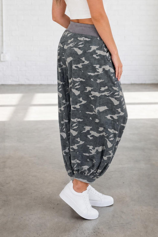
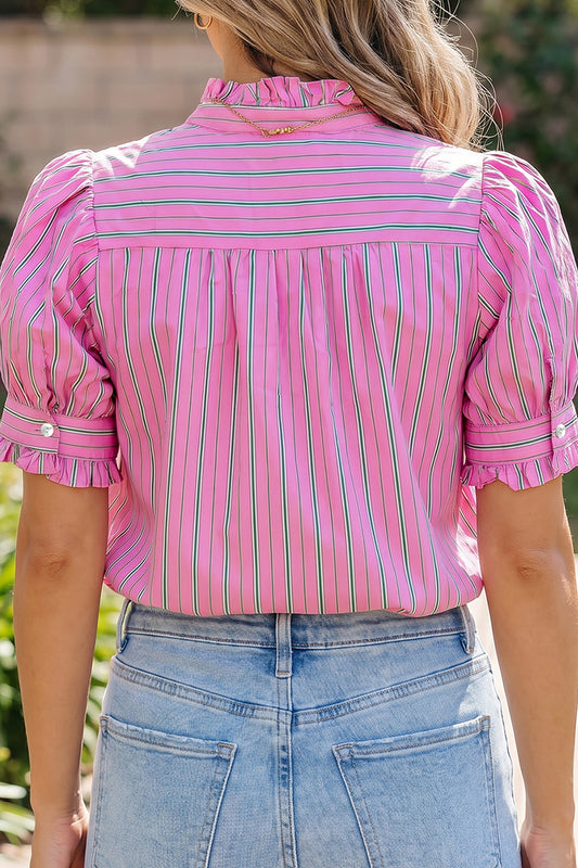
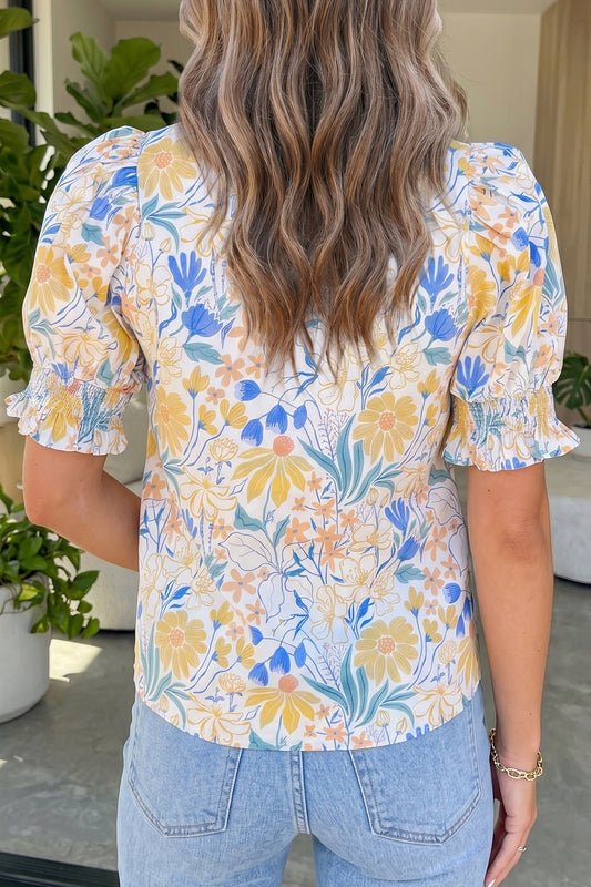
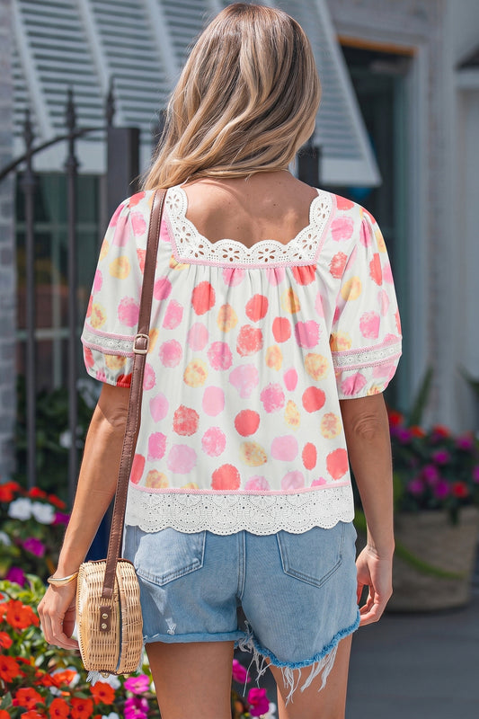
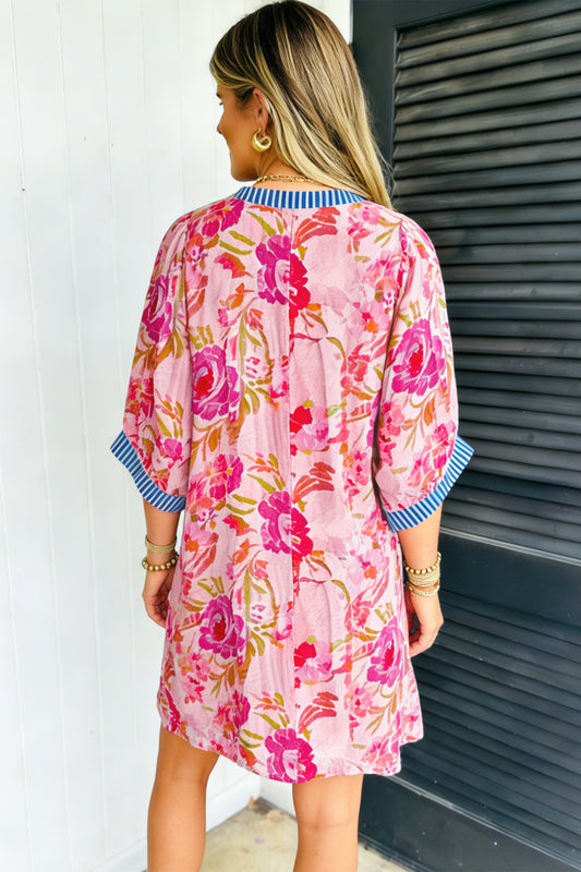
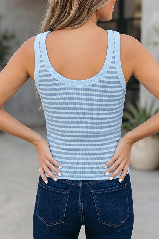
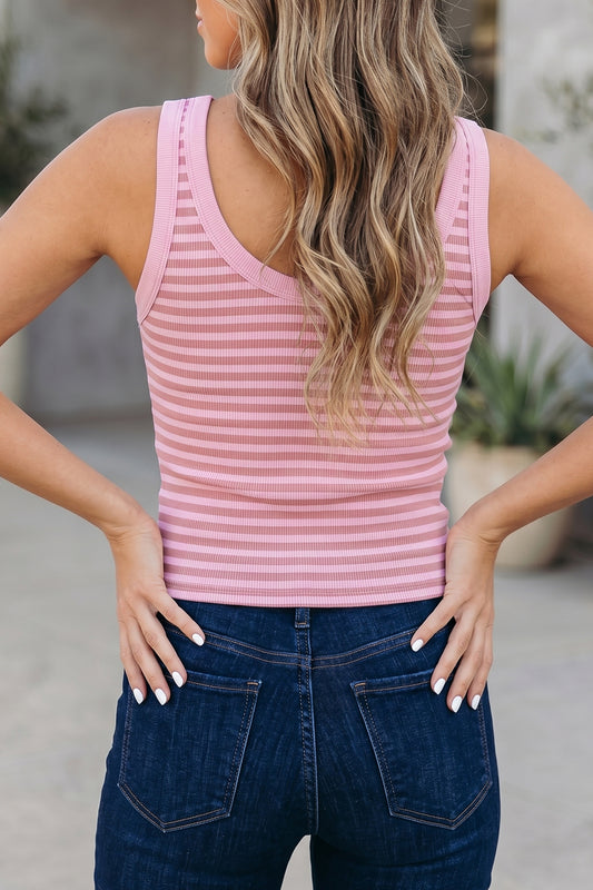
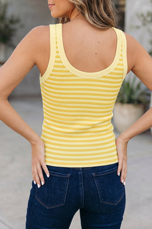
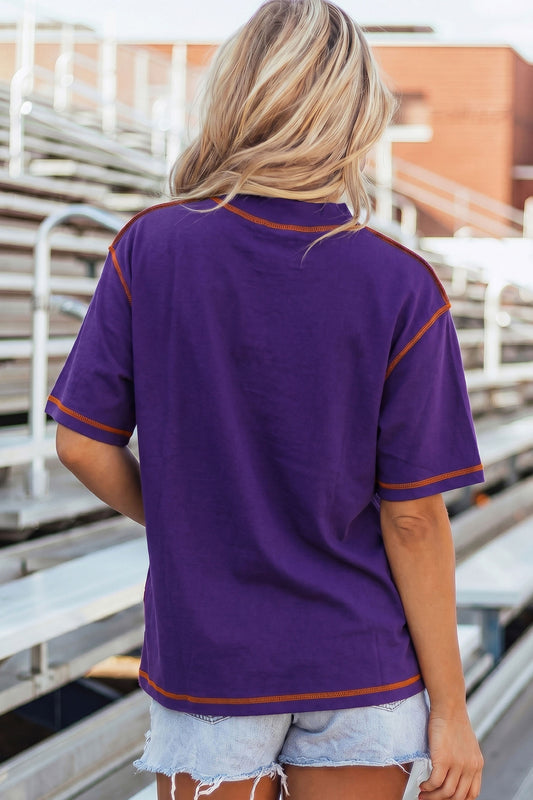
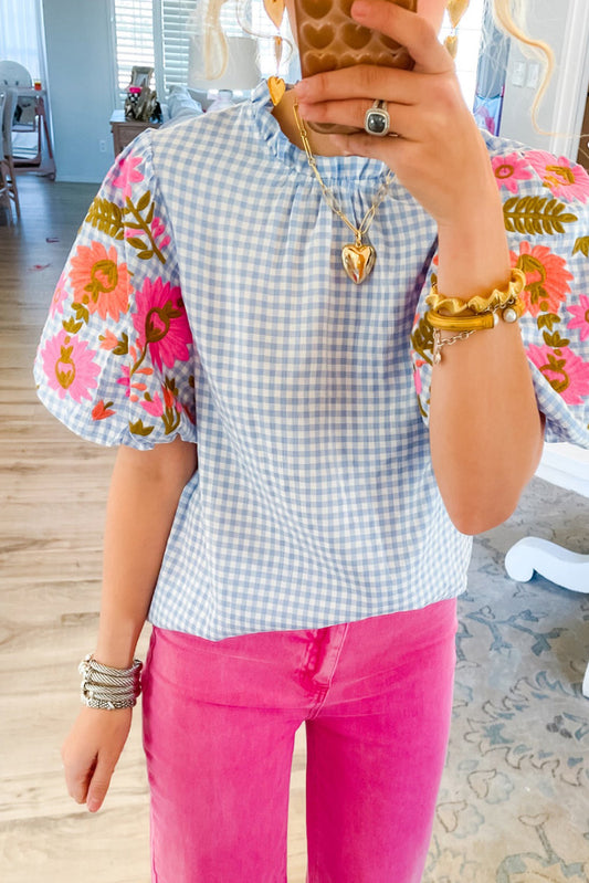
This principle works particularly well when building a vibrant wardrobe around versatile essentials. A collection of colourful separates from carefully chosen pieces such as modern tops can create dozens of wearable colour combinations without feeling repetitive.
When experimenting with colour-led styling, consider:
- One dominant colour
- One supporting colour
- One grounding neutral
This simple formula creates visual balance in outfits while maintaining the excitement that makes colour blocking so appealing.
The Colour Pairings Defining Spring Summer 2026 Fashion
The latest runway-inspired styling isn't centred around random colour clashes.
Instead, designers are embracing unexpected colour combinations that create tension, depth, and elegance.
Butter Yellow and Brown
Perhaps the most influential pairing of the season.
Butter yellow softens the richness of chocolate and caramel tones, creating a combination that feels simultaneously optimistic and grounded.
This pairing is particularly effective in elevated basics such as flowing shirts, tailored trousers, and coordinated two-piece sets.
Why it works:
- Warm undertones create harmony
- Feels luxurious without appearing formal
- Easy to wear across seasons
- Flatters a wide range of skin tones
Cobalt Blue and Red
Among the boldest examples of primary colour blocking currently appearing across designer collections.
While fire red and cobalt blue may sound intimidating, the modern approach keeps silhouettes clean and uncluttered.
Rather than adding additional colours, fashion insiders are allowing the contrast itself to become the statement.
The effect is striking, confident, and undeniably modern.
Dusty Pink and Camel
Not every colour pairing needs high contrast dressing.
Dusty pink paired with camel demonstrates how contemporary colour blocking can feel soft, elegant, and sophisticated.
The muted nature of both colours creates a polished aesthetic that's perfect for everyday colour dressing and professional environments alike.
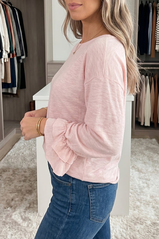
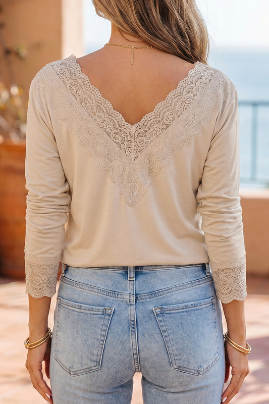
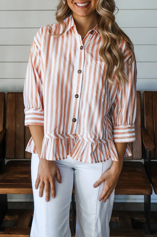
Pieces such as relaxed blouses and shirts work particularly well within this palette because they allow the colour relationship to remain the focal point.
Colour Psychology Is Shaping Fashion More Than Ever
Behind every successful colour combination lies an emotional response.
Fashion colour forecasting increasingly relies on colour psychology in fashion to predict what consumers want to wear and, more importantly, how they want to feel.
After years of uncertainty, people are gravitating toward colours that communicate:
- Optimism
- Confidence
- Creativity
- Energy
- Individuality
This explains why vibrant colour continues gaining momentum despite repeated predictions of a return to strict minimalism.
Consumers aren't simply buying clothing.
They're investing in mood, identity, and self-expression.
A bright knit, a colourful jacket, or even a pair of statement t-shirts can completely alter how an outfit feels—and how the wearer feels within it.
As fashion continues moving away from rigid styling rules, colour confidence is becoming one of the most valuable style skills a person can develop.
How to Mix Bold Colours Without Looking Overdone
One of the most searched questions surrounding the trend is simple:
How do you wear colour blocking without looking dated?
The answer lies in intention.
The early versions of colour blocking often relied on rigid geometric panels, highly saturated primary colours, and obvious combinations designed to attract attention from a distance. While those looks had their place, today's modern colour blocking feels far more nuanced.
The goal is no longer to wear colour for the sake of colour.
Instead, every shade should contribute to a larger visual story.
Follow the 70-20-10 Rule
Many stylists use a simple framework when creating colour-block outfits:
- 70% dominant colour
- 20% secondary colour
- 10% accent colour
This prevents colour overload while still allowing for bold styling.
For example:
| Dominant | Secondary | Accent |
|---|---|---|
| Camel | Dusty Pink | Burgundy |
| Butter Yellow | Chocolate Brown | Cream |
| Olive Green | Butter Yellow | White |
| Royal Blue | Red | Navy |
The result is a curated colour palette that feels deliberate rather than chaotic.
Complementary Colours vs Contrasting Colours
Understanding the difference between complementary colours and contrasting colours is one of the fastest ways to improve your colour confidence.
Complementary Colours
These sit opposite one another on the colour wheel and naturally create visual energy.
Popular examples include:
- Blue and yellow
- Red and green
- Purple and yellow
- Turquoise and aubergine
Because of their natural tension, complementary colours immediately create impact.
When executed correctly, they produce some of the most memorable statement outfits of the season.
Contrasting Colours
Contrasting colours are less about colour-wheel theory and more about creating visual distinction.
Examples include:
- Dusty pink and camel
- Butter yellow and brown
- Chocolate brown and royal blue
These combinations often feel more sophisticated because they balance excitement with subtlety.
For those new to colour-led styling, contrasting colour palettes are often easier to wear than highly saturated complementary pairings.
The best colour combinations don't compete with each other. They elevate each other.
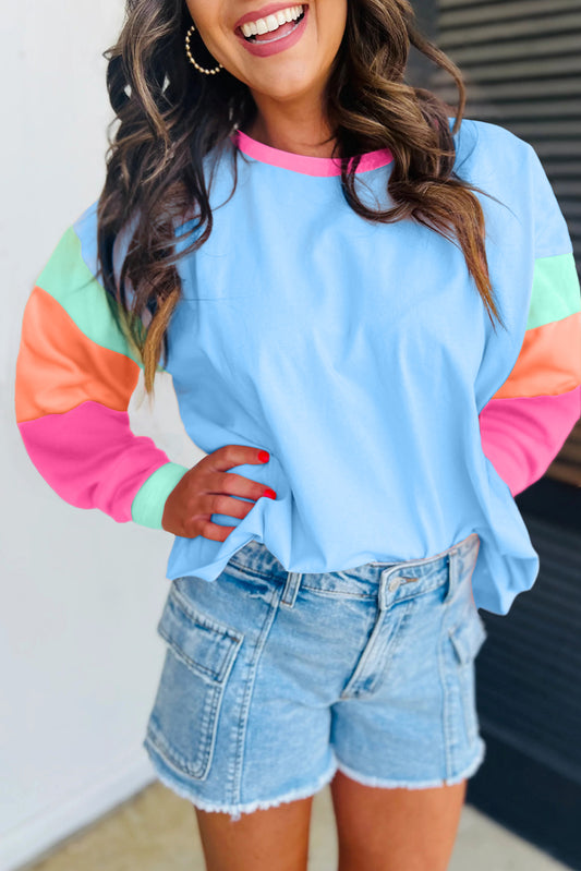
The Return of Primary Colour Blocking
Among the biggest runway colour trends is the return of primary colours.
However, this isn't the playful, cartoon-inspired version many people remember.
Today's primary colour blocking feels sharper, cleaner, and more architectural.
Designers are pairing:
- Fire red and cobalt blue
- Blue and yellow
- Green and yellow
- Red with rich navy
- Bright blue with cream
The key difference is silhouette.
Instead of relying on complicated designs, fashion houses are using clean lines, oversized silhouettes, and minimalist tailoring to allow the colours themselves to take centre stage.
This creates an elevated colour dressing effect that feels contemporary rather than nostalgic.
Building a Capsule Wardrobe With Colour
Many people assume a vibrant wardrobe requires dozens of brightly coloured garments.
In reality, a capsule wardrobe with colour can be surprisingly streamlined.
Start with a small collection of versatile pieces that can be mixed repeatedly.
Consider including:
Essential Colour Foundations
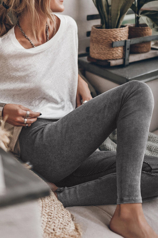
- Tailored trousers
- Wide-leg jeans
- Relaxed shirts
- Lightweight knitwear
- Structured jackets
- Statement dresses
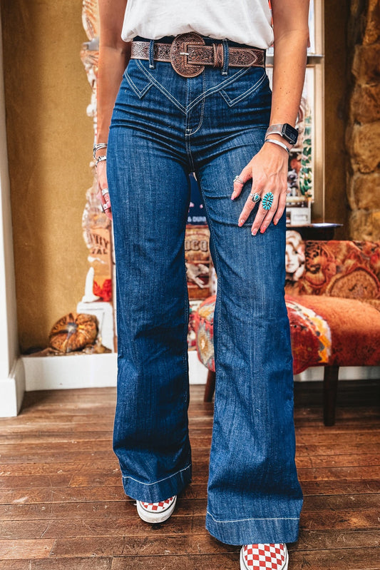
Well-selected pieces from versatile categories such as bottoms create the foundation for countless wearable colour combinations throughout the year.
The goal isn't abundance.
It's flexibility.
A thoughtfully chosen royal blue trouser may prove more versatile than five black alternatives when integrated into a colour-conscious wardrobe.
Why Tonal Dressing Still Matters
Interestingly, the rise of colour blocking has not replaced tonal dressing.
Instead, the two approaches now work together.
A tonal outfit built around varying shades of one colour can act as the perfect gateway into more adventurous colour combinations.
Examples include:
Blue Tonal Dressing
- Sky blue shirt
- Cobalt knit
- Navy trousers
Green Tonal Dressing
- Sage blouse
- Olive trousers
- Forest green outerwear
Brown Tonal Dressing
- Camel shirt
- Chocolate trousers
- Tan accessories
These combinations create depth while maintaining cohesion.
For individuals exploring modern ways to wear bright colours, tonal dressing offers a comfortable starting point before progressing toward higher-contrast combinations.
The Influence of Scandinavian Colour Styling
Some of the most influential examples of refined colour blocking are emerging from Scandinavian fashion capitals.
Unlike the maximalist fashion trend often associated with colour, Scandinavian colour styling focuses on:
- Clean silhouettes
- Strategic colour placement
- Functional layering
- Understated accessories
- Strong visual balance
The result is a form of chromatic dressing that feels effortless.
Rather than relying on excessive embellishment, colour becomes the focal point.
A pair of wide-leg jeans combined with a saturated knit or oversized shirt can create the same visual impact as a much more complicated outfit.
This approach perfectly reflects the direction of fashion colour trends 2026: bold yet restrained, expressive yet sophisticated.
Colour Blocking for Everyday Life
One reason this trend has gained such widespread appeal is its practicality.
The best colour pairings for summer 2026 are surprisingly wearable.
You don't need a fashion week invitation to embrace colour.
Simple adjustments can transform everyday outfits:
Easy Colour Blocking Outfit Ideas
- Pair olive green and butter yellow separates.
- Add a cobalt blue layer to an otherwise neutral outfit.
- Introduce statement hues through knitwear.
- Combine dusty pink and camel for understated elegance.
- Use colourful outerwear as the focal point of an outfit.
- Experiment with colour accent pieces before committing to full colour-block looks.
This gradual approach helps develop colour confidence while ensuring outfits remain authentic to personal style.
The most successful examples of everyday colour dressing rarely feel forced. They simply feel considered.
As more people embrace expressive luxury and move beyond the restrictions of minimalist fashion, colour is becoming one of the most effective tools for creating individuality without sacrificing sophistication.
Luxury Colour Styling: Why Colour Is the New Status Symbol
For years, luxury fashion relied heavily on understatement.
Neutral palettes, discreet branding, and tonal wardrobes became shorthand for sophistication. Yet as the quiet luxury backlash continues to influence fashion conversations, a different form of elegance has emerged.
Colour.
Not loud, attention-seeking colour for the sake of visibility, but intentional colour dressing that communicates confidence and individuality.
The most influential designers aren't abandoning refinement; they're redefining it through colour harmony, rich colour palettes, and sophisticated rainbow-inspired styling.
This shift explains why luxury colour styling has become one of the defining themes of spring summer 2026 fashion.
Rather than asking:
"Can I wear this colour?"
Fashion's most stylish dressers are asking:
"How can I wear this colour better?"
That subtle change in perspective has transformed the way people approach their wardrobes.
Modern Rainbow Dressing Without the Clichés
The phrase "rainbow dressing" often brings to mind every colour being worn simultaneously.
In reality, modern rainbow dressing is far more selective.
Today's approach focuses on carefully curated colour stories rather than visual overload.
A successful contemporary colour blocking look may incorporate multiple shades while still maintaining balance.
Consider combinations such as:
- Turquoise and aubergine with cream accents
- Olive green and butter yellow with soft white
- Chocolate brown and royal blue with camel
- Cobalt blue and red grounded by navy
Each pairing creates energy without becoming overwhelming.
This is what separates sophisticated colour blocking from costume-like dressing.
The emphasis remains on cohesion.
Signs of Refined Colour Blocking
- Colours feel intentional rather than random
- Silhouettes remain clean
- Accessories support rather than compete
- Contrasts are balanced with neutrals
- Colour placement guides the eye naturally
When these elements work together, even the boldest shades appear elegant.
Statement Pieces Worth Investing In
A common misconception about colourful dressing is that every item needs to be bright.
In reality, a single statement piece can transform an entire wardrobe.
Strategic investments often deliver the greatest impact.
High-Impact Colour Pieces
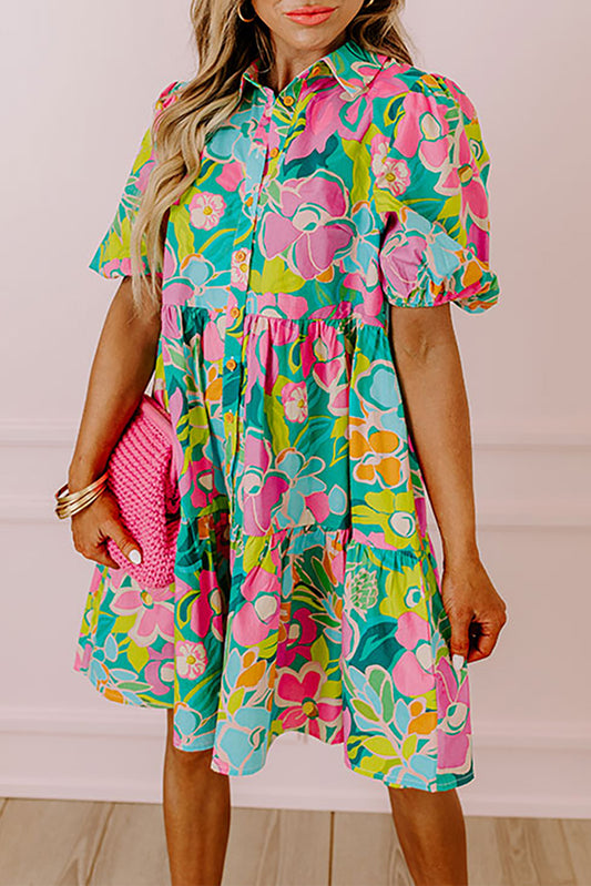
1. Statement Dresses
A well-chosen colourful dress offers one of the easiest ways to embrace colour without coordinating multiple separates.
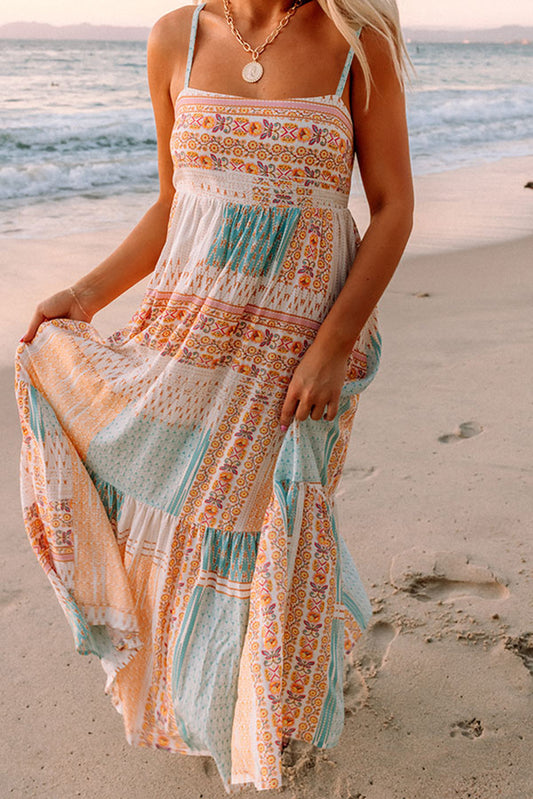
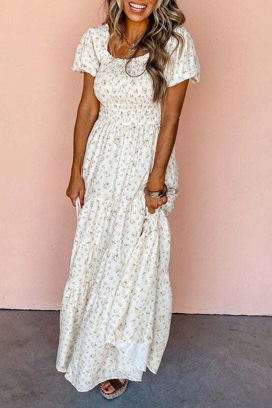
Whether in jewel tones, sunset tones, or sophisticated primary colours, standout pieces from a collection of dresses can become year-round wardrobe heroes.
2. Colourful Tailoring
Tailored blazers and trousers in unexpected shades continue dominating runway-inspired colour blocking.
These pieces provide structure while allowing colour to become the focal point.
3. Statement Knitwear
Knitwear remains one of the safest entry points into bold colour dressing.
A vibrant knit instantly introduces personality without requiring an entirely new wardrobe.
4. Colourful Outerwear
Coats and jackets create maximum visual impact because they are often the first thing people notice.
Even a simple outfit can feel transformed when layered beneath colourful outerwear.
Fashion Colour Trends for Women 2026
Women's fashion continues embracing greater experimentation with colour.
Among the strongest themes emerging from designer colour trends are:
Saturated Hues
Bright colours are no longer reserved for holidays or special occasions.
Cobalt, emerald, tomato red, and marigold are increasingly appearing in everyday wardrobes.
Elevated Colour Dressing
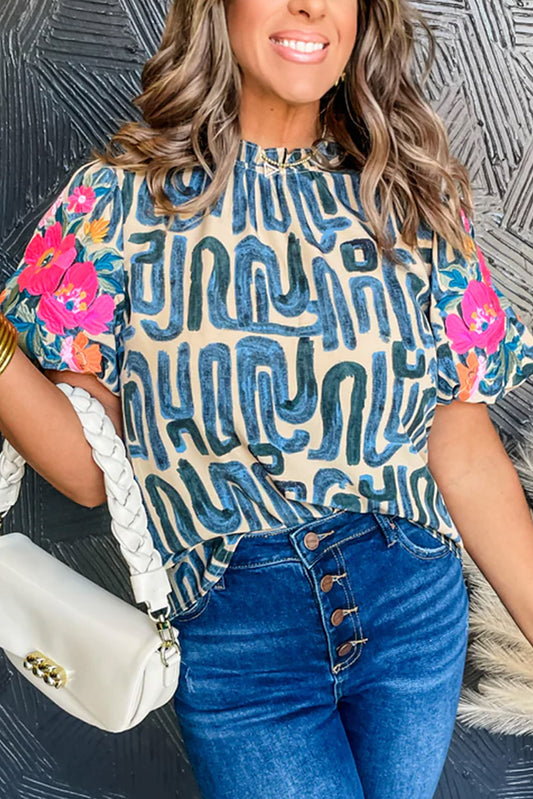
Rather than relying on prints, many designers are using blocks of pure colour to create visual interest.
This creates cleaner, more modern outfits.
Colour Layering
Layering multiple shades within the same outfit has become a hallmark of editorial fashion styling.
Examples include:
- Butter yellow beneath camel
- Royal blue beneath navy
- Pink layered with burgundy
- Green layered with olive
The result feels polished rather than overwhelming.
Fashion Colour Trends for Men 2026
Menswear is also experiencing a significant shift toward expressive dressing.
Historically, men have often relied on neutral foundations with colour appearing only through accessories.
That approach is changing.
Current fashion colour trends for men 2026 include:
- Primary colour blocking
- Colourful tailoring
- Relaxed silhouettes in bold shades
- Statement knitwear
- Colour-blocked separates
- Artistic dressing inspired by gallery culture
Many of the strongest menswear looks focus on one standout colour balanced against classic wardrobe staples.
This makes the trend surprisingly accessible regardless of personal style preferences.
How Colour Blocking Creates Timeless Style
One of the biggest concerns surrounding trend-driven dressing is longevity.
Will these colours still feel relevant next year?
The answer depends less on the colours themselves and more on how they're worn.
Timeless colour blocking prioritises:
- Quality over quantity
- Strong silhouettes
- Balanced colour relationships
- Versatile wardrobe foundations
- Personal expression over trend chasing
Fashion colour forecasting may influence which shades dominate the season, but good colour theory remains constant.
Blue and yellow will continue working.
Brown and butter yellow will continue feeling luxurious.
Camel and pink will continue appearing elegant.
The specific shades may evolve, but the underlying principles endure.
Final Thoughts
The resurgence of colour blocking in 2026 represents more than another seasonal trend.
It reflects a broader shift in how people approach style.
After years dominated by restraint, consumers are embracing colour confidence, self-expression through fashion, and the freedom to build wardrobes that feel personal rather than prescribed.
The most successful looks aren't necessarily the brightest.
They're the most intentional.
Whether you're experimenting with complementary colours, exploring contrasting colour palettes, building a capsule wardrobe with colour, or simply introducing a single statement colour into your outfits, the modern approach is refreshingly straightforward:
Wear colour with purpose.
Because the future of fashion isn't about choosing between minimalism and maximalism.
It's about finding the perfect balance between the two.
And that balance may just be the most sophisticated way to wear colour yet.
Frequently Asked Questions About Colour Blocking in 2026
1. Is colour blocking suitable for all ages?
Absolutely. One of the biggest misconceptions about colour blocking is that it's only for younger fashion enthusiasts. In 2026, sophisticated colour blocking focuses on colour harmony, quality fabrics, and thoughtful styling rather than loud or youthful trends. Muted colour combinations, rich jewel tones, and tailored silhouettes can make colour blocking elegant and age-appropriate for any generation.
2. What colours should beginners avoid when trying colour blocking?
If you're new to colour blocking, it's often best to avoid combining multiple highly saturated shades at once. Pairings involving neon colours or three or more competing bright tones can feel overwhelming. Starting with one bold colour alongside neutrals or muted complementary shades tends to create a more polished result.
3. Can colour blocking work in a professional workplace?
Yes. Modern colour blocking is increasingly common in professional settings. Structured blazers, tailored trousers, midi dresses, and refined separates in coordinated colours can create a confident and polished appearance. Shades such as camel, navy, olive green, burgundy, and dusty pink often work particularly well in office environments.
4. Does colour blocking make you look taller or shorter?
When used strategically, colour blocking can actually help create the illusion of height. Vertical colour placement, monochromatic columns of colour, and tonal dressing can elongate the body. In contrast, strong horizontal colour divisions may visually shorten proportions depending on where they are placed.
5. What accessories work best with colour-block outfits?
The best accessories typically complement rather than compete with the outfit. Neutral handbags, minimalist jewellery, classic footwear, and understated belts help maintain visual balance. If your clothing already contains bold colour combinations, accessories often work best when kept simple.
6. Can you wear colour blocking during autumn and winter?
Definitely. Colour blocking is no longer limited to spring and summer. Autumn and winter wardrobes can incorporate rich colour palettes such as burgundy, forest green, chocolate brown, navy, mustard, aubergine, and camel. Layering these shades creates depth while maintaining seasonal sophistication.
7. How do fashion stylists choose colour combinations?
Professional stylists often rely on colour theory, seasonal trend forecasting, skin-tone analysis, and visual balance. They also consider fabric texture, garment shape, and the emotional impact of certain colours. The most successful outfits usually combine technical colour knowledge with personal style preferences.
8. Is colour blocking still fashionable beyond 2026?
While specific trending colours may change, colour blocking itself is considered a timeless styling technique. Designers have revisited colour blocking repeatedly for decades because it allows for creativity, self-expression, and visual impact. Well-executed colour combinations rarely go out of style.
9. Which fabrics showcase colour blocking most effectively?
Smooth fabrics with clean finishes tend to highlight colour blocking particularly well because they allow colours to appear crisp and uninterrupted. Materials such as cotton, satin, crepe, linen blends, knitwear, and structured tailoring fabrics often display colour contrasts more effectively than heavily textured materials.
10. Can colour blocking help create a more sustainable wardrobe?
Yes. Building a wardrobe around versatile colour combinations can encourage more outfit repetition and reduce unnecessary purchases. When garments are selected with intentional colour coordination in mind, individual pieces can be mixed and matched across multiple outfits, supporting a more thoughtful and sustainable approach to fashion.